A customer has already decided to buy.
Checkout is a strange part of the product. Your customer has already done the hard part. They've found what they want and decided to spend money on it. Then the checkout asks them to do more work.
Enter an address. Choose a payment method. Apply a coupon. Remember another password. Confirm another detail.
None of these steps feels significant on its own. Together, they can turn a purchase that felt effortless into a process that feels like work.
And that's where conversion starts leaking.
The problem isn't necessarily that your checkout has too many screens.
It's that it keeps asking the customer to do something they shouldn't have to do. If you've already collected an address, why ask for it again? If someone has a preferred payment method, why make them search for it? If a coupon is available, why make them figure out where it belongs?
Good checkout design removes these questions before they become friction.
It should feel less like filling out a form and more like completing something you've already decided to do.
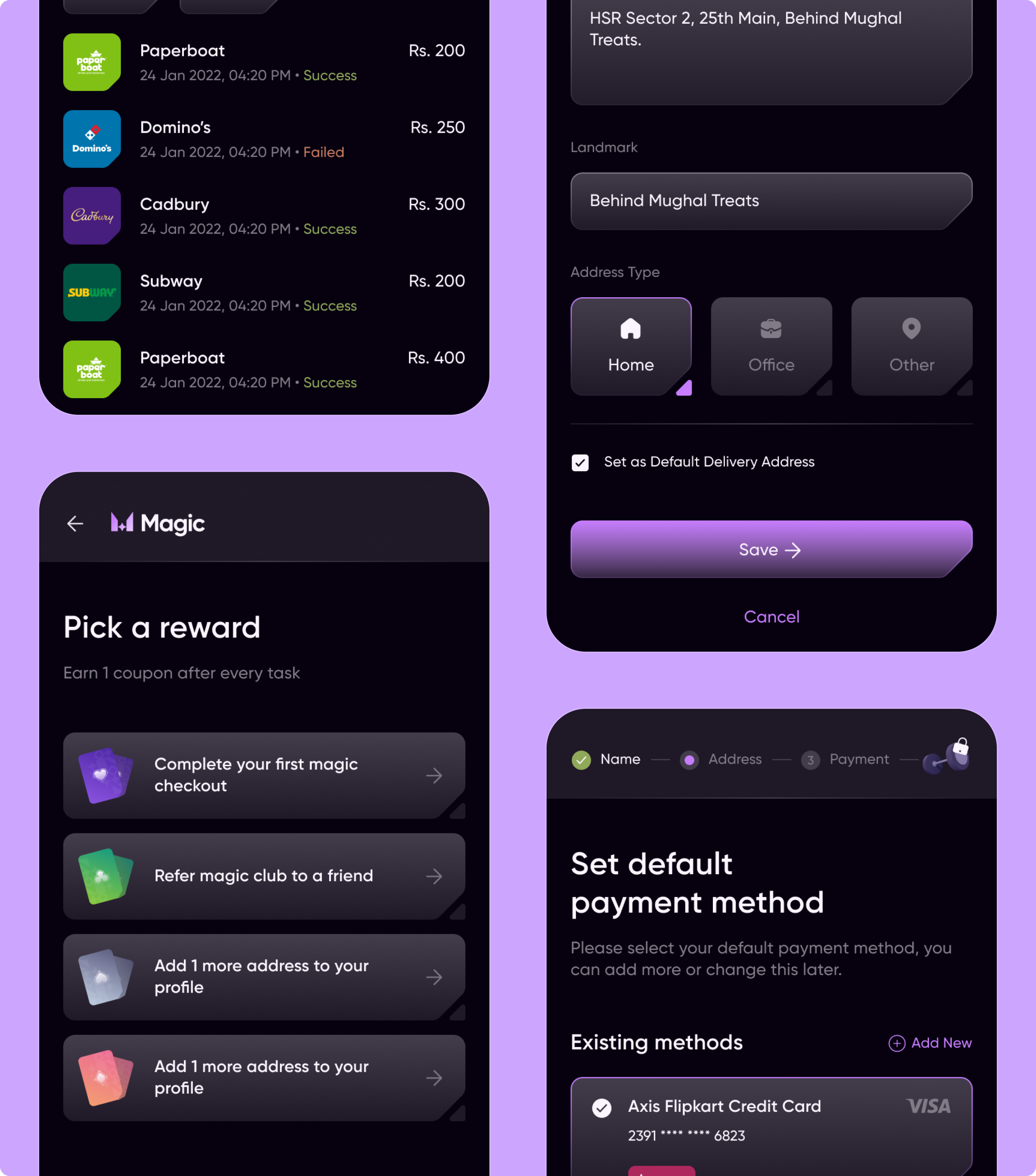
This was the challenge behind Razorpay Magic, a one-click checkout solution designed to make digital payments faster and easier.
The experience was redesigned around a simple idea: reduce the amount of work between intent and payment. Saved addresses, payment methods, and coupons were brought into a pre-filled checkout flow, reducing the amount of information customers had to enter themselves. The end-to-end journey was mapped from login through checkout, helping simplify complex payment flows rather than treating each screen as a separate interaction.
The interface was also redesigned around clearer hierarchy, visual cues, iconography, typography, and mobile-optimized flows so the important decisions were easier to make.
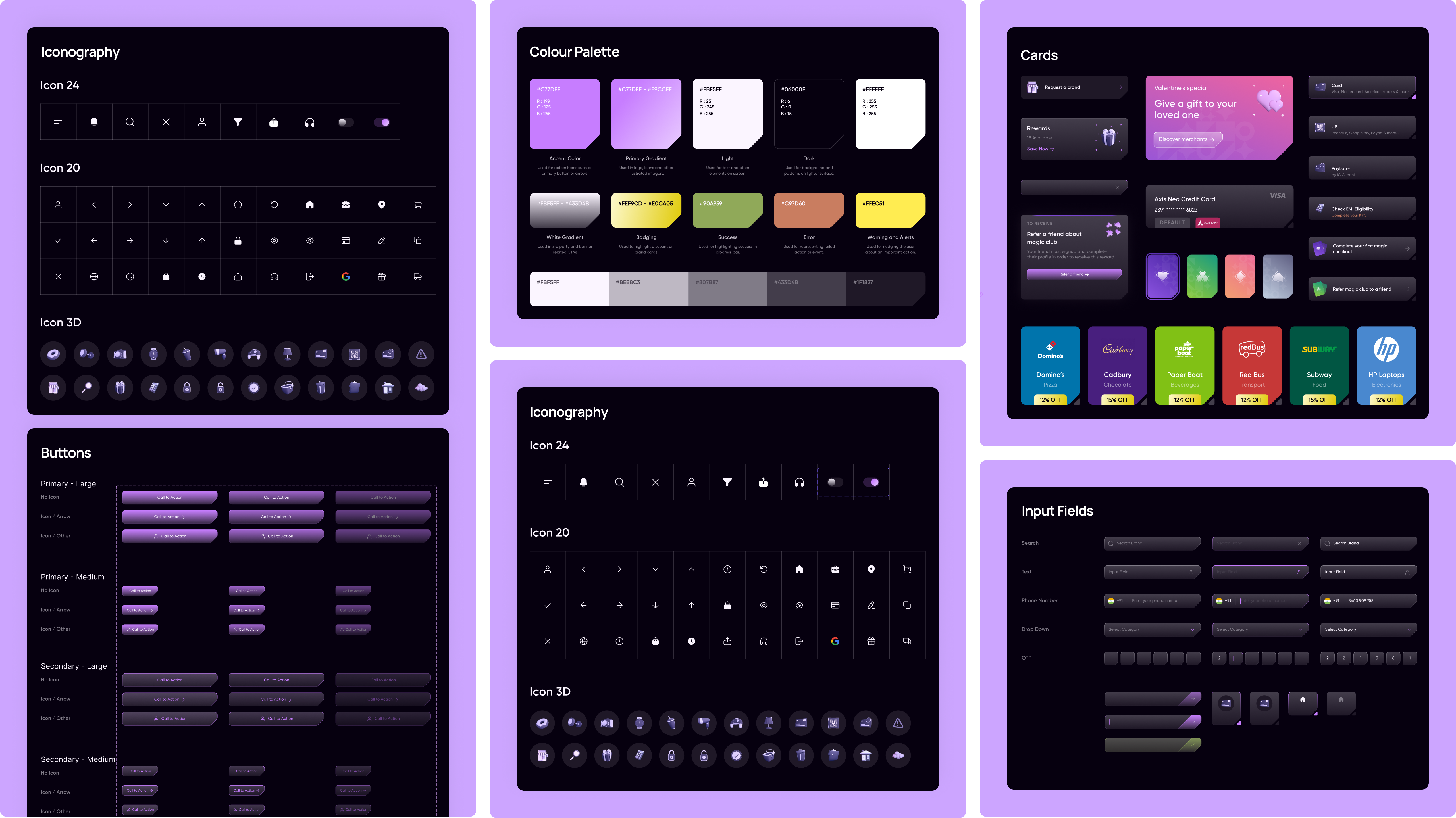
The obvious outcome was speed. Razorpay Magic made checkout 5× faster. But the more important result was what happened to conversion.
Conversion increased by 20%, while checkout abandonment was reduced.
There's a useful distinction between removing steps and removing effort.
You don't necessarily need fewer screens. You need fewer things for someone to figure out, remember, enter, or decide. That's what makes a checkout feel fast.Not the number of buttons. Not the number of screens.
The amount of work left for the customer.
This is one of the many issues from our fintech UX pattern library, built from real projects across payments, banking, lending, and financial services.
Full case study: Razorpay Magic on NetBramha