%20(1)%20(1).avif)
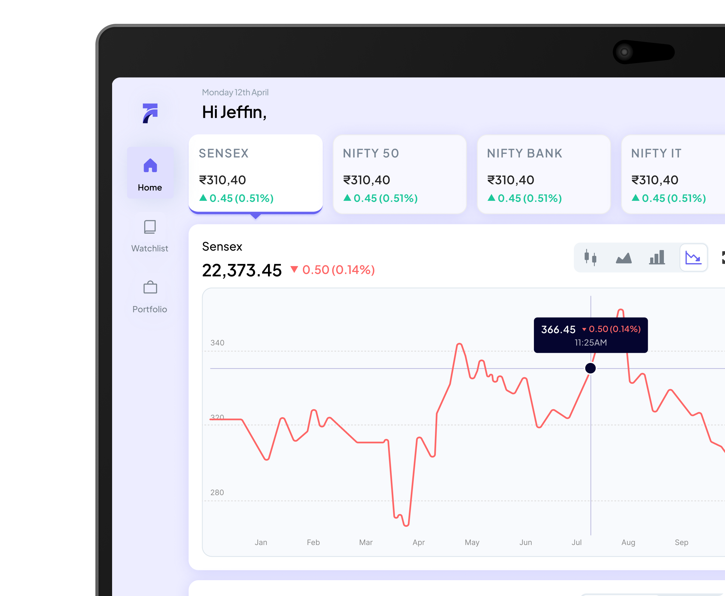
Information Architecture is the process of organizing and structuring information within a digital product so that users can find the right information and complete tasks. It involves creating layouts for screens or pages and designing user flows that show how users will interact with the product.
Findability Enhancement
Organizing information clearly helps users locate what they need easily, enabling a seamless and intuitive navigation experience.
Task Completion Support
Well-structured content enables users to complete key tasks efficiently without confusion or unnecessary effort.
Content Clarity
Information architecture sheds light on how content should be structured so that it aligns with users’ goals and expectations.
User Flow Optimization
Designing logical user flows ensures that users move through the product in meaningful and predictable ways.
Stakeholder Communication
A clear IA helps teams and stakeholders understand product structure, guiding better design and development decisions.
Blueprint for UX
Information architecture provides a blueprint for experience design, clarifying how information and interactions come together.
Information architecture plays a foundational role in UI/UX design by enabling users to find the right information easily within digital products. It defines how content is organized and presented, ensuring that interfaces support efficient navigation and task completion.
It helps designers build logical user flows and screen layouts, making sure users feel oriented and confident as they interact with the product. This clarity reduces confusion and enhances overall user satisfaction.
By providing a structured blueprint of information and interactions, information architecture supports cohesive design decisions that align user goals with product functionality and business objectives.
.avif)


Usually architecture. Navigation confusion almost always traces back to how content was categorized before anyone drew a screen — which items live together, what gets top-level visibility, how the mental model the product uses maps onto how users actually think about the same information.
Redesigning the visual layer won't fix it. If the underlying taxonomy is wrong, a cleaner UI just makes the wrong structure look better. The conversation that needs to happen is about organization, not aesthetics — and that's an information architecture conversation, not a visual design one.
When NetBramha worked on Springer Nature's research discovery platform, the content challenge wasn't ten pages. It was millions of scientific papers, thousands of subject categories, and users ranging from PhD researchers to undergraduate students — all trying to navigate the same system with completely different mental models of how scientific knowledge is organized.
The IA work involved mapping how different user types mentally categorized the same content, then designing a taxonomy that served the most critical tasks without collapsing into a search-everything fallback. That's the kind of structural problem that can't be solved with better search alone — it requires deliberate decisions about hierarchy, grouping, and what the product treats as primary versus secondary.
Card sorting is the most direct — users physically group content items in ways that feel intuitive to them, revealing how they mentally categorize information that a product team often categorizes by internal logic instead. Tree testing follows: users navigate a proposed structure to find specific items, without any visual design applied, exposing where the taxonomy breaks down under real task conditions.
Both methods produce findings that are hard to argue with because they come from observed behavior rather than stakeholder preference. The IA decisions that survive these tests tend to stay stable through the entire design process, which is why doing them before wireframing saves significant rework downstream.
Not always rebuilt, but always examined. A taxonomy that works cleanly in English can break in languages where compound concepts work differently, or where the cultural framing of a category doesn't translate directly. Right-to-left languages don't just reverse the visual layout — they can alter the hierarchy of what feels primary.
NetBramha has worked on IA for products expanding from India into the Gulf and the UK, including teams based in Edinburgh and Kuwait, and the audit at that stage almost always surfaces at least one category structure that made sense in the original market and creates friction in the new one. Catching it before development is the difference between a localization project and a restructuring project.
Yes, though it's a secondary benefit rather than the primary goal. A well-structured IA means content is organized into coherent, meaningful categories with clear parent-child relationships — which is exactly what search engines and AI systems use to understand what a site is about and surface the right pages for the right queries.
The primary goal is always human findability: making sure a user can locate what they need without resorting to search. But when that's done well, the structural clarity that helps users navigate also helps crawlers index and LLMs cite. NetBramha's IA work connects directly into visual design and the broader design process. Get in touch if your product's content has outgrown the structure it was built on.