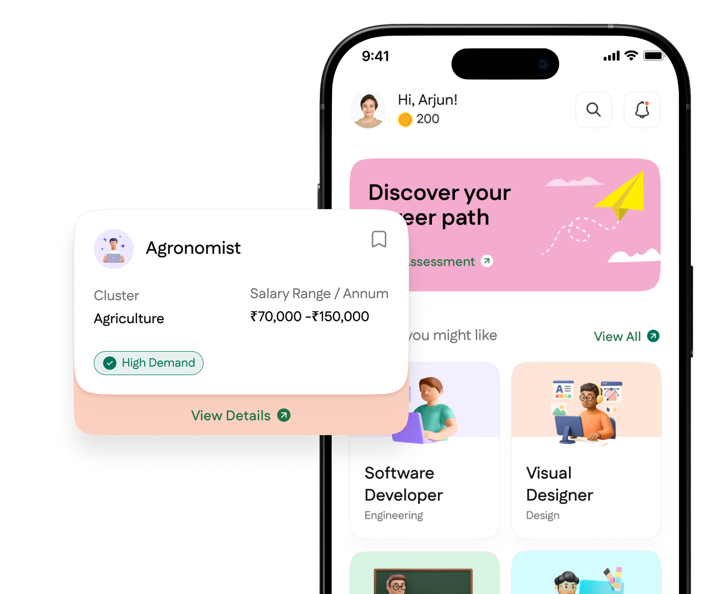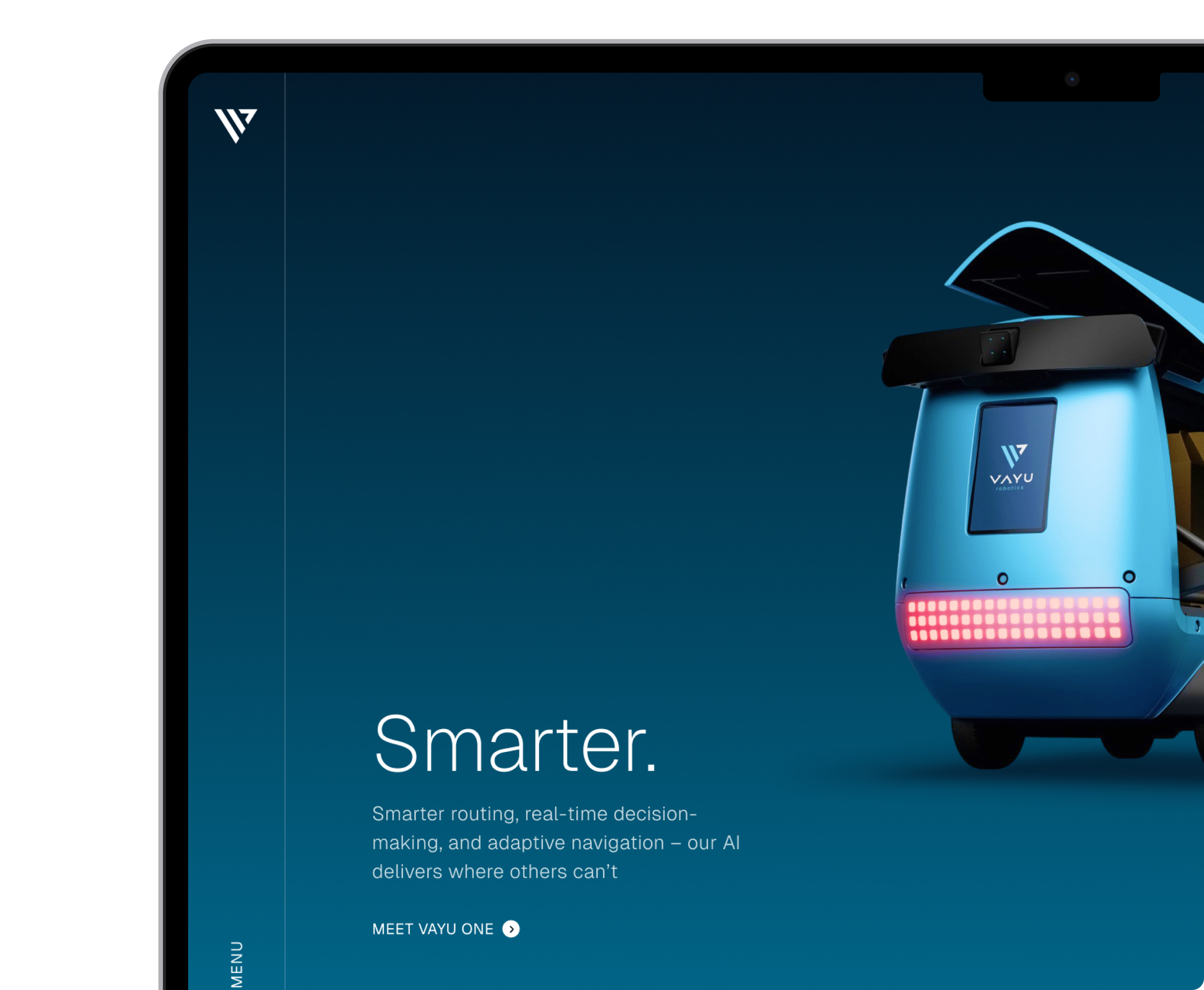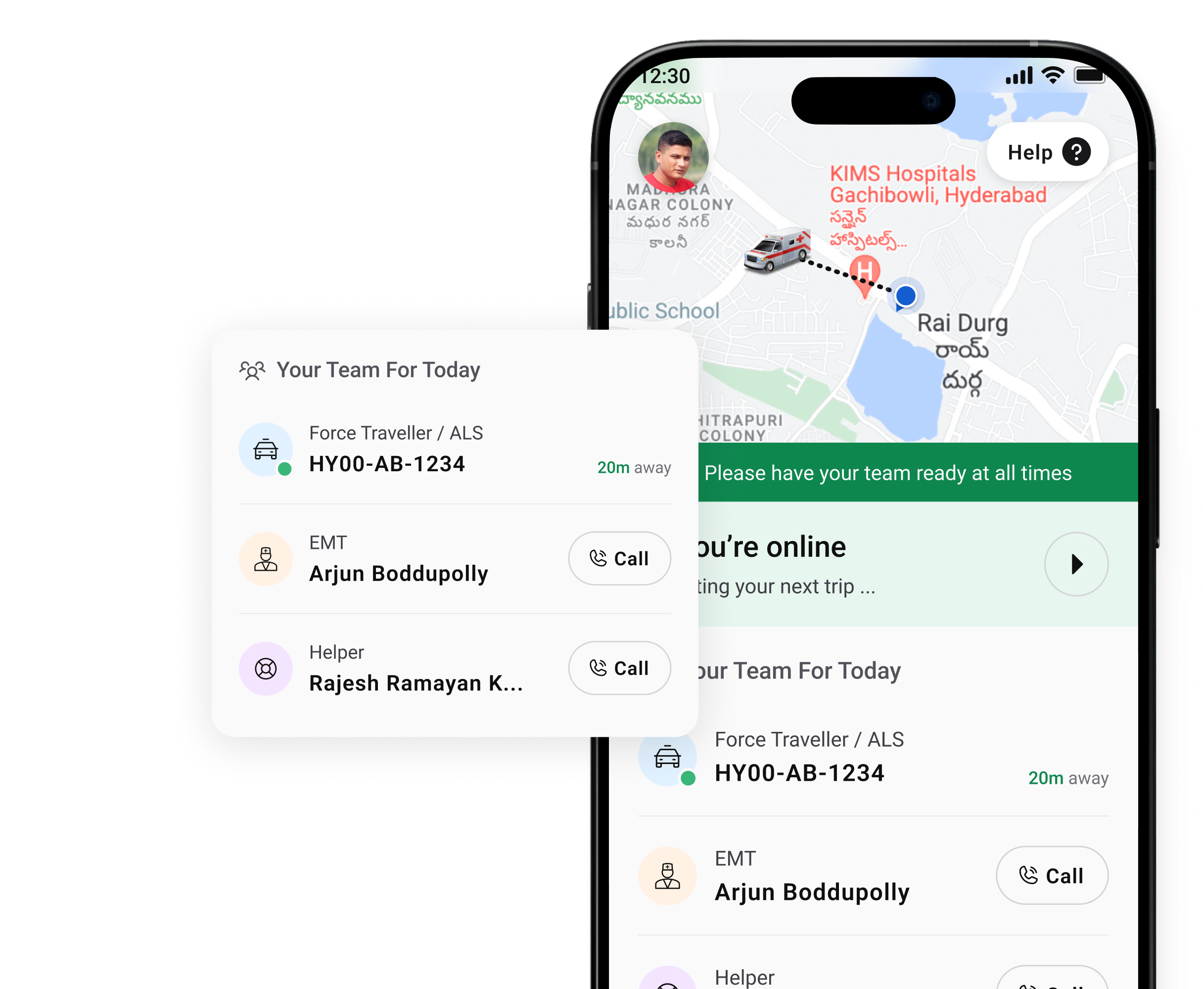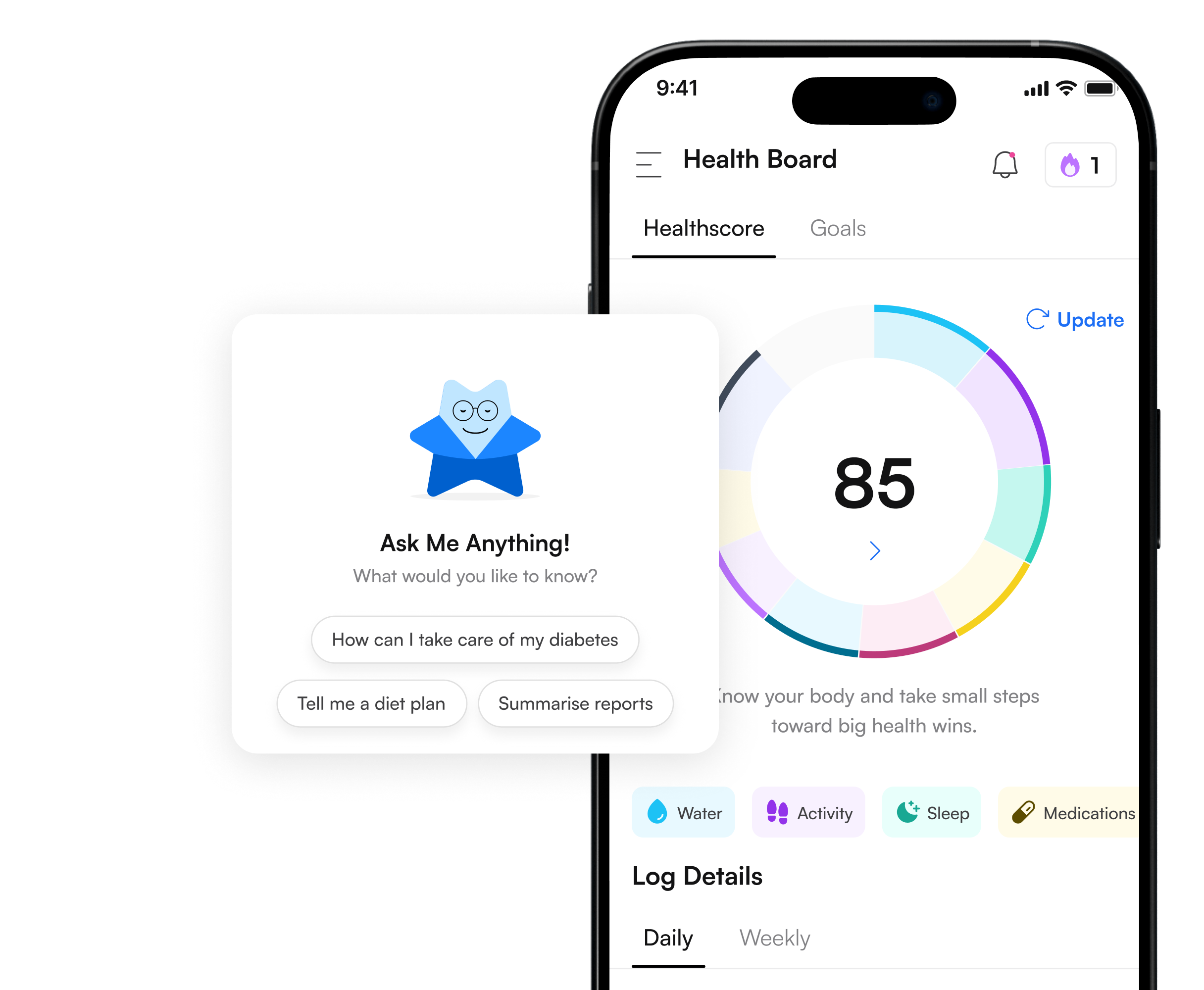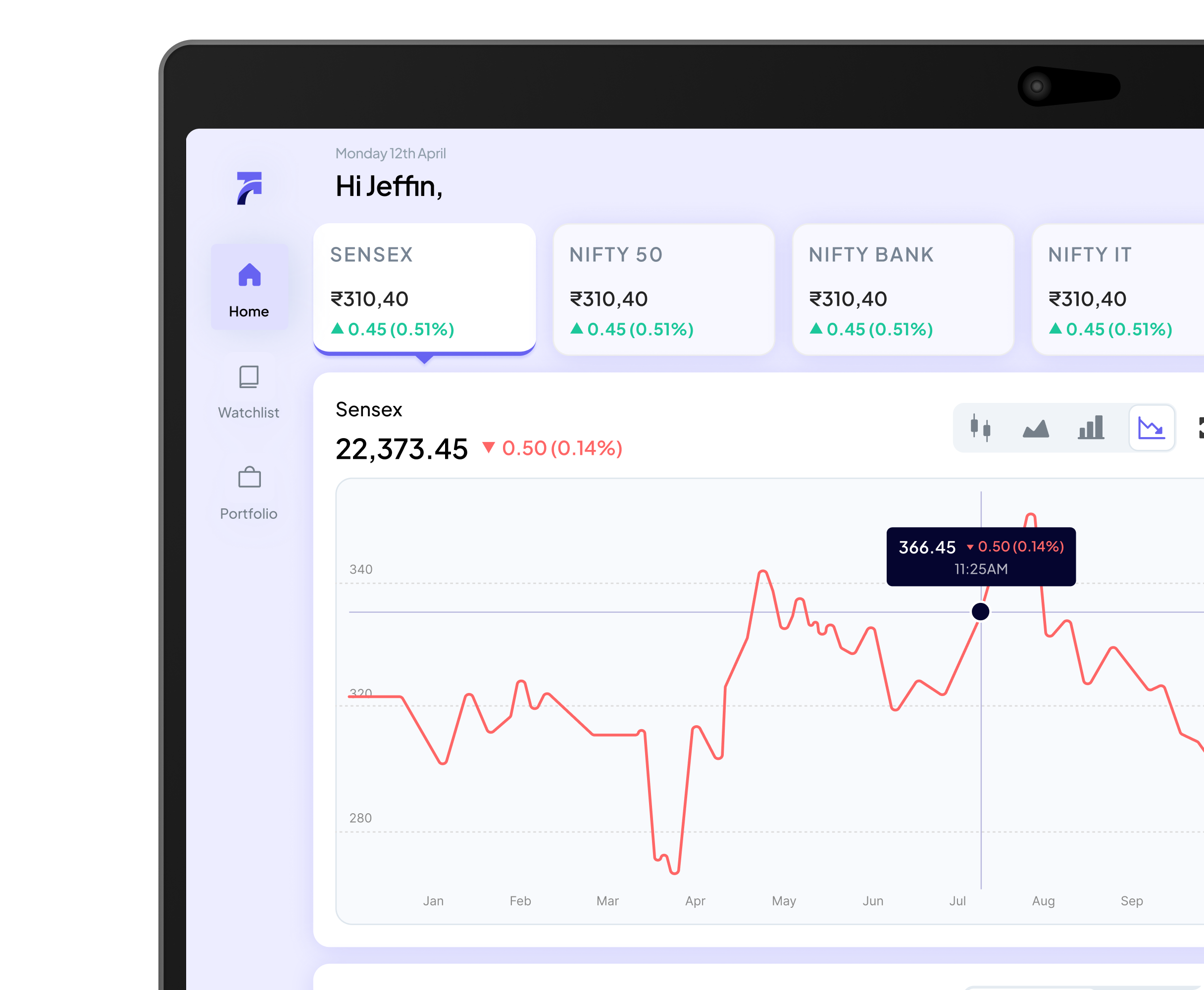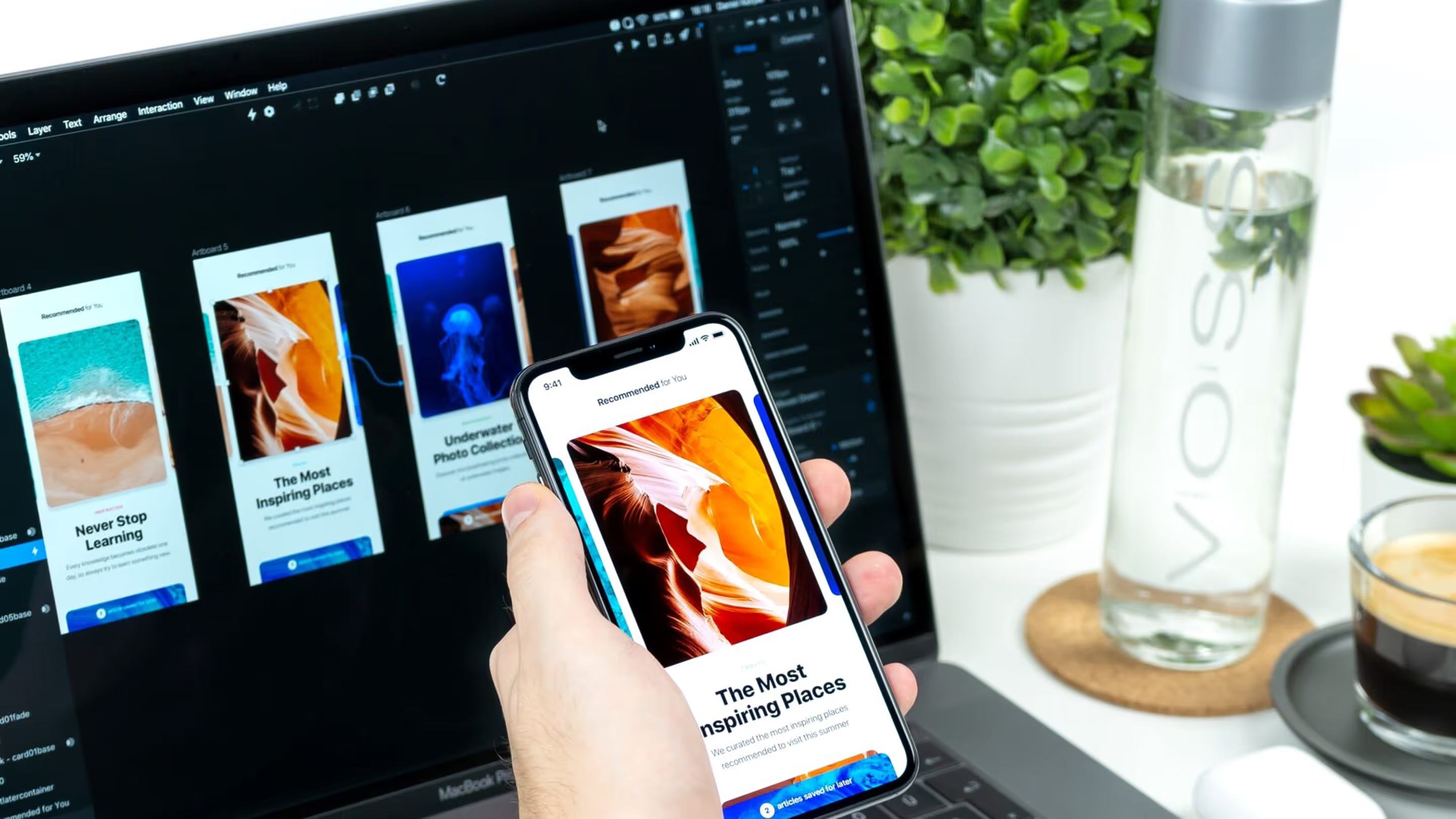
Contrary to popular belief, visual design is not just about increasing the aesthetic appeal of a digital product. Visual design is about enhancing visual appeal and the usability of the product through strategic placement of visual design elements & assets including images, typography, colors, layout, & even space.
First Impressions Matter
Visual design helps create a strong first impression because users typically form opinions about a digital interface within a fraction of a second.
Usability Enhancement
By organizing visual elements clearly, visual design improves readability, scanning, and task completion across the interface.
Emotional Engagement
A thoughtful visual language evokes emotions that make users more connected and likely to continue interacting with the product.
Brand Identity Support
Consistent visual design strengthens brand identity and makes the product more recognizable and memorable to users.
Communication Clarity
Visual cues such as color, typography, and spacing aid in conveying meaning and guiding user attention effectively.
Task Efficiency
Strategic visual design helps users complete tasks faster by reducing cognitive load and supporting intuitive interactions.
Visual design plays a key role in UI/UX design by enhancing usability and visual appeal, making digital interfaces easier to understand and use. It ensures that screens not only look good but also guide users smoothly through interaction flows.
By using strategic visual elements and consistent design language, visual design helps reduce friction, improve clarity, and create more intuitive experiences on every screen. These aesthetic decisions support user goals while maintaining brand expression.
Additionally, thoughtful visual design contributes to brand recognition and trust, strengthening long-term engagement and user satisfaction. It helps users feel confident and comfortable interacting with the product repeatedly.
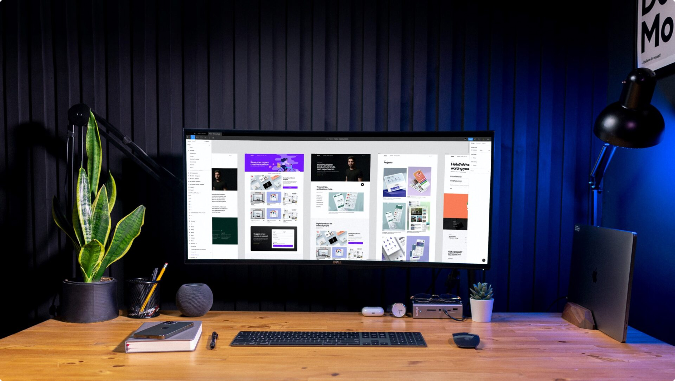


More than most people assume. A buyer committing to a property worth hundreds of thousands of dollars through a screen — without walking the site, without a sales agent in the room — needs the interface to do something a transactional UI rarely has to do: create genuine confidence that what they're seeing is real, credible, and worth the commitment.
In the EMAAR engagement, every visual decision — the typographic weight on pricing, the way renders were presented, the spacing around confirmation steps — was in service of trust, not aesthetics. The visual design was the sales environment. That's a different brief than making an app look polished.
A design system is a documented library of visual components — buttons, typography, color tokens, spacing rules, icon sets — built to ensure that every screen a team produces looks and behaves consistently, regardless of which designer or developer built it.
A product needs one earlier than most teams think. The point where a codebase has ten screens designed by different people in different Figma files, with slightly different button states and inconsistent spacing, is the point where fixing visual inconsistency becomes a project rather than a correction. NetBramha builds design systems as part of the visual design process, not as a cleanup task afterward, so they're usable from the first handoff rather than retrofitted at launch.
By not putting subjective preference at the center of the conversation. Visual design decisions at NetBramha are grounded in the information architecture and user journey work that preceded them, which means there's a rationale behind every hierarchy choice, every typographic decision, every use of contrast. "I don't like it" is a harder position to hold when the response is "here's what this visual decision is doing for the user at this moment."
That doesn't mean stakeholder input doesn't matter — it does. But grounding the conversation in function rather than taste keeps it productive and shortens the revision cycle considerably.
The principles are universal. The application isn't. Color associations shift across cultures — what reads as trustworthy in one market can read as alarming in another. Typography that works in Latin scripts needs rethinking for Devanagari, Arabic, or other scripts where letterform density and line height behave differently. Visual hierarchy that feels spacious in Bristol can feel sparse and unfinished to users in Austin, where expectations around information density on a screen differ noticeably.
NetBramha designs with these variables in context from the start, rather than producing a single visual system and appending localization as an afterthought. Eighteen years across India, the US, the Middle East, and the UK means these aren't theoretical considerations.
The handoff includes annotated, production-ready screens in Figma with component libraries, interaction specifications, spacing documentation, and a design system built to the token level — not a folder of static exports that a developer has to reverse-engineer. Every state is covered: hover, active, disabled, error, empty, loading.
This feeds directly into development without a translation layer between what was designed and what gets built, which is where most visual quality loss happens. It also connects back into animation and motion work if the product calls for it. Get in touch if you want visual design that holds up all the way to production, not just in a client presentation.