.avif)
Geojit Financial Services is a leading investment services company offering a wide range of financial products to investors across India.
The existing digital trading experience required modernization to improve usability, simplify complex financial workflows, and deliver a more intuitive experience for investors navigating market data and transactions.
Our mission was to redesign Geojit’s digital trading platform with a user-centered approach that simplifies financial interactions, improves navigation clarity, and enhances overall investor confidence through intuitive and structured experiences.
through simplified layouts and structured information hierarchy for seamless navigation.
enabled by better organization of financial data and streamlined interaction flows.
achieved by refining trading journeys to reduce friction and complexity.
fostered through a consistent visual system aligned with financial credibility.
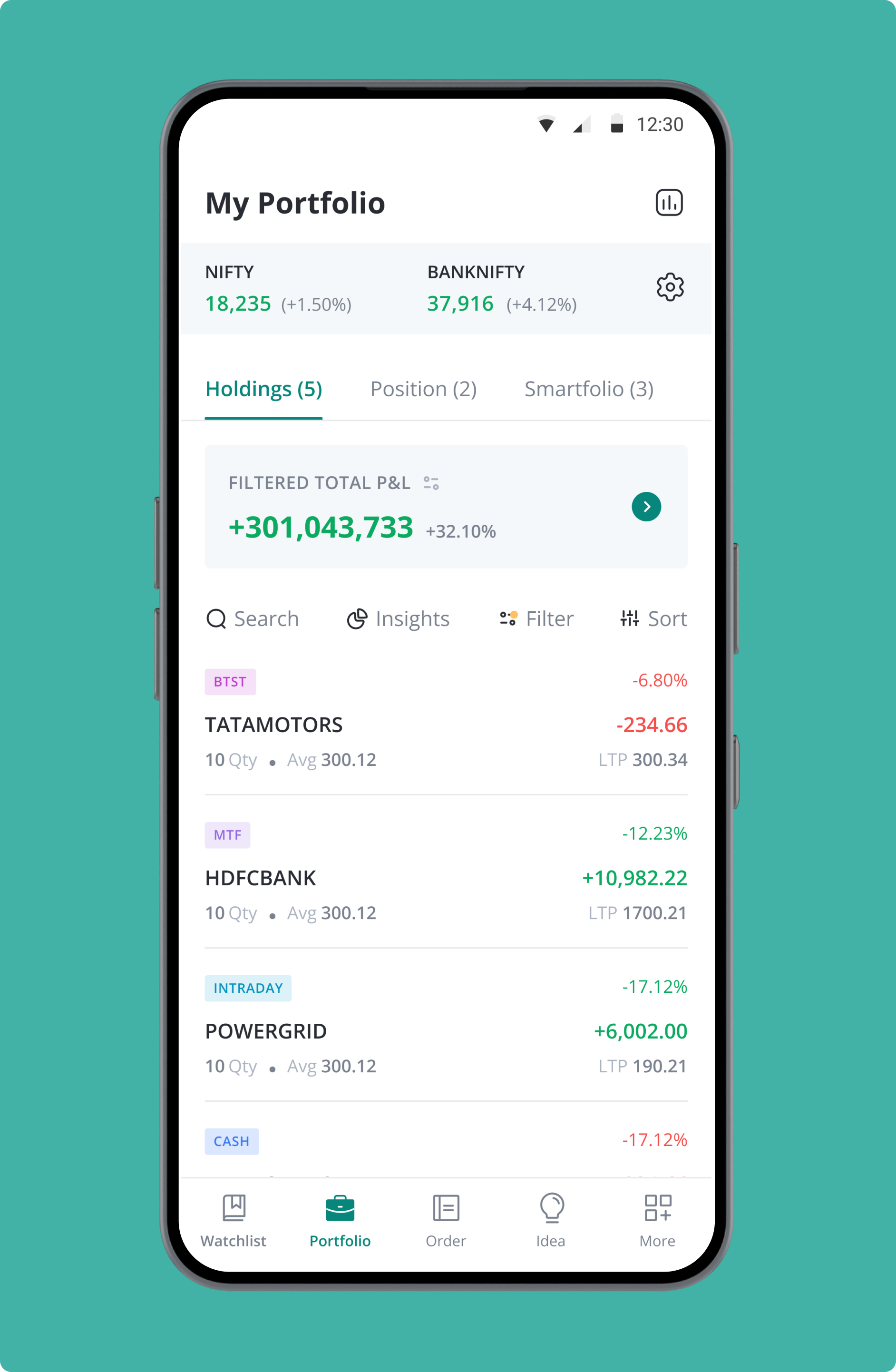
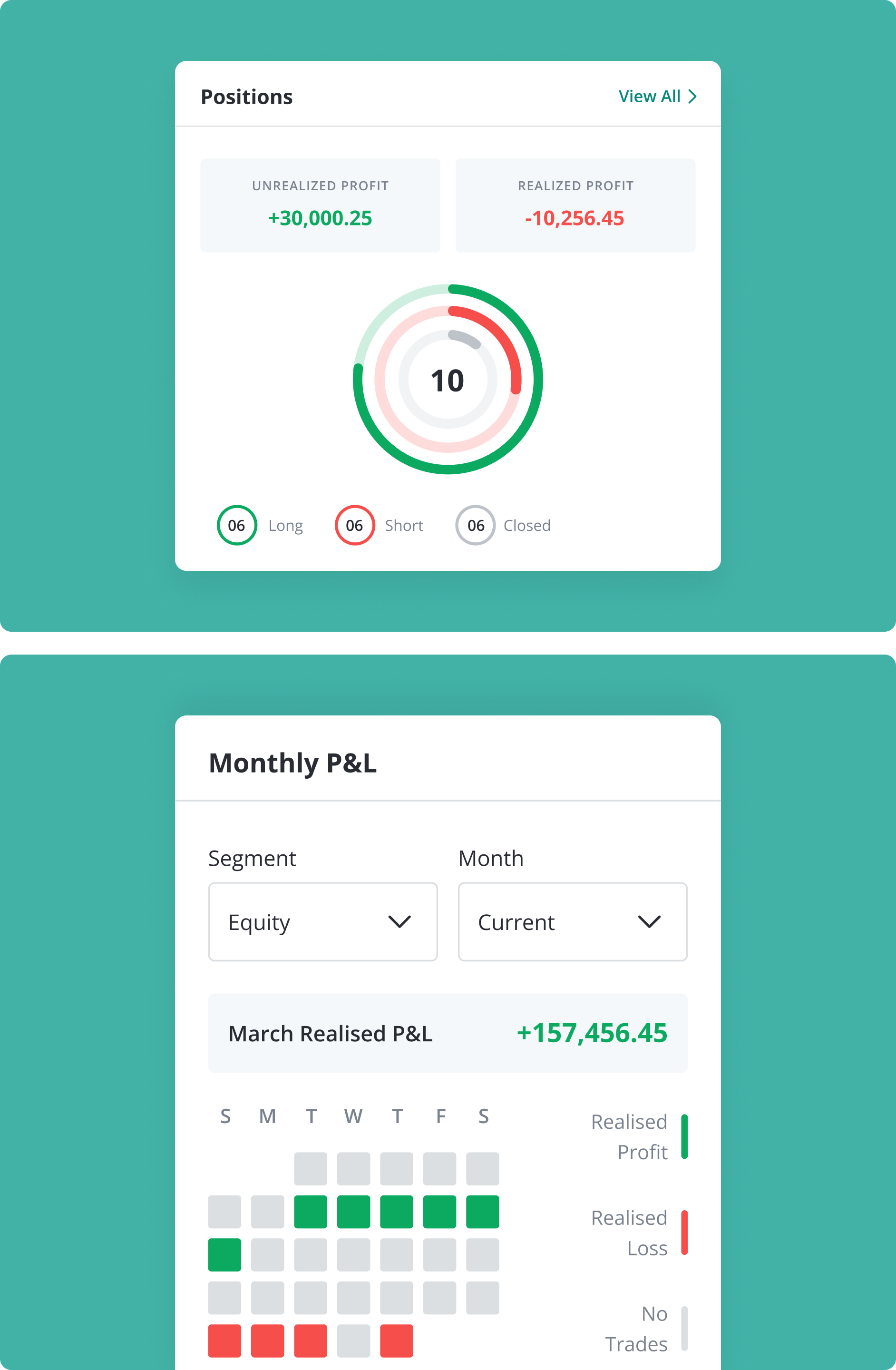
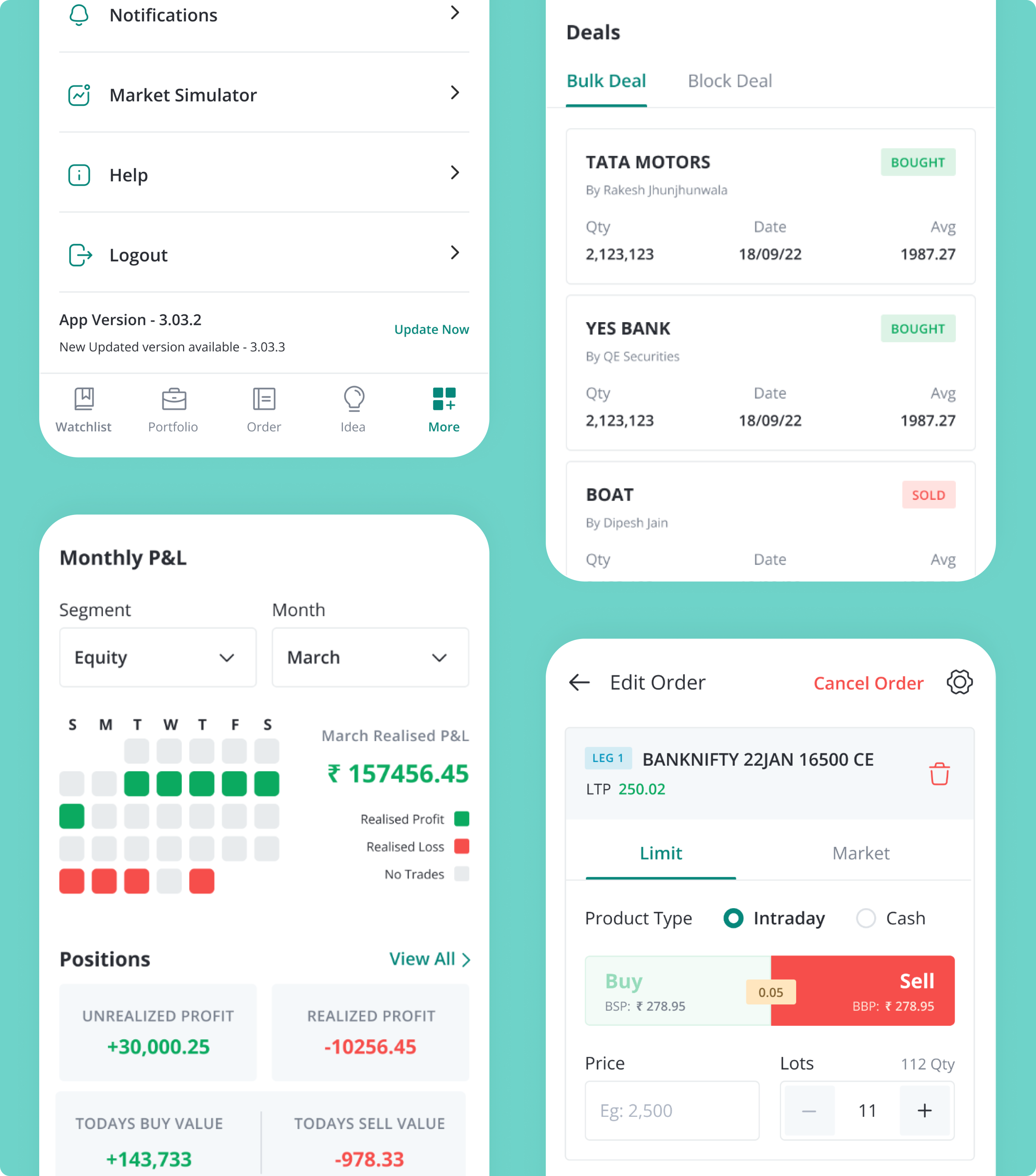
Track holdings, positions, and monthly performance with clear visual insights.
Track market movements seamlessly with intuitive layouts across dark and light modes.
Enhances recognition with distinctive, scalable icons aligned to financial actions and categories.
.png)
Unifies portfolio data, positions, and performance into a clear, actionable overview.
.png)
Track holdings, positions, and monthly performance with clear visual insights.
Track holdings, positions, and monthly performance with clear visual insights.
Track market movements seamlessly with intuitive layouts across dark and light modes.
Track market movements seamlessly with intuitive layouts across dark and light modes.
Enhances recognition with distinctive, scalable icons aligned to financial actions and categories.
Enhances recognition with distinctive, scalable icons aligned to financial actions and categories.
Unifies portfolio data, positions, and performance into a clear, actionable overview.
Unifies portfolio data, positions, and performance into a clear, actionable overview.
For Geojit Financial Services, the redesign leveraged UX and visual design to create a more structured, intuitive, and confidence-driven trading experience.
through simplified dashboards
through streamlined workflows
through cohesive visual system
.png)
Enhanced financial storytelling, reduced cognitive load, and reinforced brand trust across product touchpoints.
.png)
Structured information architecture and intuitive user flows streamline navigation, improving task completion and overall usability significantly.
.png)
.png)
Low-fidelity dashboard wireframes map layout hierarchy, enabling rapid iteration, alignment, and usability validation early on.
.png)
.png)
Refined dashboard visual design enhances clarity, hierarchy, and consistency, enabling faster comprehension and confident decision-making.

Comprehensive stock overview presents key metrics, trends, and performance data for quick, informed decision-making.
.png)
.png)
Mobile app wireframes define core interactions, ensuring intuitive navigation, scalability, and efficient user task flows.

Polished mobile visual design enhances usability, consistency, and engagement through refined layouts and clear visual hierarchy.

Comprehensive design system defines typography, iconography, and color palette, ensuring consistency and scalable visual language.
Geojit is one of India's first SEBI-registered stockbrokers, founded in 1987. NetBramha redesigned its digital trading platform to make investing usable for both experienced traders and newer retail investors on the same interface.
A 1987 founding date matters more than it might seem: Geojit's existing customer base includes traders with decades of habits built around specific workflows, so the redesign had to earn adoption rather than force it. NetBramha faced a comparable legacy-user challenge on HDFC Bank's mobile app, where an established customer base made backward compatibility as important as improvement.
Trading interfaces have to present dense, fast-changing financial data (prices, holdings, market movements) in a way that supports quick decisions, without the simplification techniques that work for most consumer software.
That's a genuinely different discipline from something like IAMIN's savings-focused design, where the goal is reducing decisions, not supporting rapid ones. Geojit required NetBramha to design for information density and speed rather than minimalism.
Geojit is NetBramha's primary retail stockbroking credential. The closest comparison in the portfolio is Yubi, though Yubi serves institutional debt markets rather than retail equity trading - different asset class, different regulatory regime, similar density-first design discipline.
Both projects required NetBramha to resist the instinct to simplify data that professional or semi-professional users actually need to see in full, rather than hidden behind extra taps.
SEBI is India's securities regulator, and stockbroking platforms operate under strict disclosure and compliance rules. Geojit's redesign had to work within those constraints - nothing could be reformatted in a way that changed what regulated financial information legally had to show.
That's a genuinely different constraint from ClearTax's tax-filing UX or TransUnion CIBIL's credit reporting, even though all three sit in regulated fintech - each regulator imposes different rules on what the interface is permitted to simplify.
Both, on the same interface, which was the core design tension. Geojit's existing base skews toward experienced investors, while the growth opportunity is newer retail traders entering the market for the first time.
NetBramha resolved this the same way it approached HDFC Bank's redesign: rather than building two separate products, both experience levels were served through progressive disclosure - simple by default, with depth available on demand.
Recommended Next
.avif)


